Grosvenor Casinos Logo
I designed the Grosvenor Casinos logo so it now features a roundel that is reminiscent of a poker chip, the script of the G in the centre, and the clear type of ‘GROSVENOR CASINOS’ surrounding it.
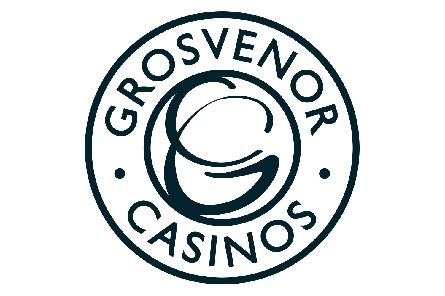
The logo was essentially an update of the old logo, so the brief was to make it more clear and to represent a poker chip as the old logo was cluttered and nobody got the GC (for Grosvenor Casinos) in the middle.
All the initial variations were put through market research, I sat behind a tinted glass window with the Marketing Director to observe the outcome, which was a very interesting experience having been on the other side myself in the past.
Slide the bar on the second image to see the before and after.
ClientGrosvenor CasinosYear2015


